The Role of Negative Space in Iconic Logos-Logo Design
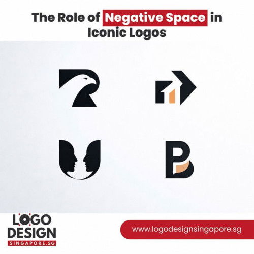
What is left unseen can be just as powerful as what is immediately visible, in the world of visual identity. Negative space, often described as the empty or unused area surrounding or within a design, plays a critical role in shaping how logos are perceived, remembered, and understood. Far from being wasted space, it is a deliberate design tool that enhances clarity, depth, and meaning. In iconic logos, negative space transforms simplicity into sophistication, creating marks that resonate deeply with audiences and endure across generations. Negative space functions as a silent communicator. While the primary shapes and typography carry the direct message, the surrounding emptiness gives those elements room to breathe. Without adequate space, even the most creative concept can feel crowded or overwhelming. A well-balanced logo leverages negative space to establish harmony, guiding the viewer’s eye naturally across the design. This balance contributes to immediate recognition, a fundamental goal of any successful brand identity. One of the most significant advantages of negative space is its ability to create dual meaning. Through careful arrangement of shapes and spacing, designers can embed subtle visual cues within the logo. These hidden layers add intrigue and depth, encouraging viewers to engage more closely with the mark. When audiences discover a secondary visual element within the design, it fosters a sense of delight and connection. This emotional response strengthens memorability and reinforces brand impact. Beyond visual intrigue, negative space enhances legibility. Logos must function across various platforms, from large-scale signage to small digital icons. Excessive detail can become lost or distorted when scaled down. Strategic use of empty space simplifies the overall composition, ensuring clarity at any size. The absence of clutter allows core elements to stand out distinctly, preserving the integrity of the design across mediums. Another important function of negative space is visual hierarchy. The best logo designer, hierarchy determines which elements capture attention first and how the eye moves across the composition. By manipulating spacing around shapes and text, designers can emphasize certain components without adding extra graphics. This subtle direction maintains elegance while ensuring that the brand’s name or symbol remains dominant and recognizable. Psychologically, negative space contributes to perceptions of sophistication and confidence. Brands that embrace minimalism often appear more refined and assured. The willingness to leave space unfilled communicates restraint and clarity of purpose. In contrast, overcrowded logos can convey uncertainty or a lack of focus. The strategic use of emptiness signals that every element has been carefully considered, reflecting professionalism and intentionality. Negative space also supports versatility. Logos must adapt to different backgrounds, color schemes, and materials. When a design incorporates thoughtful spacing, it remains flexible in both light and dark applications. The interplay between filled and empty areas allows for seamless inversion or monochromatic use. This adaptability ensures longevity, a key attribute of iconic branding. From a compositional standpoint, negative space contributes to balance and proportion. Every shape within a logo interacts with the surrounding emptiness. Adjusting spacing by even a small margin can dramatically alter the visual weight of the design. Precision is essential, as uneven or inconsistent spacing can disrupt harmony. The most successful logos demonstrate meticulous alignment, where negative space feels intentional rather than accidental. Become a Medium member In addition to balance, negative space enhances storytelling. Logos are often tasked with conveying complex ideas in a simplified form. Through creative manipulation of space, designers can suggest motion, transformation, or connection without overcrowding the design. This subtle storytelling deepens the conceptual strength of the logo while maintaining visual simplicity. For professionals striving to master this technique, understanding negative space requires both artistic intuition and technical discipline. It demands careful observation of how shapes interact and how viewers perceive contrast. The best logo designer recognizes that negative space is not merely a background element but an active participant in the design. Mastery lies in knowing when to subtract rather than add, allowing the concept to emerge naturally through spatial relationships. Negative space also influences brand perception in digital environments. With increasing emphasis on responsive design and mobile viewing, clarity and simplicity are paramount. Logos that rely on heavy detail or intricate patterns often struggle in smaller formats. In contrast, those built with strong spatial awareness retain impact and readability, ensuring consistent brand recognition across devices. Another dimension of negative space is its role in emotional resonance. Clean, open designs evoke feelings of calmness and order. The absence of visual noise creates a sense of trust and reliability. This emotional undertone can shape how audiences perceive a brand’s personality. Minimal yet meaningful designs often communicate transparency and modernity, aligning with contemporary expectations. Furthermore, negative space contributes to scalability and reproduction quality. Logos are reproduced across diverse materials, from digital screens to print surfaces and merchandise. Designs with balanced spacing maintain clarity regardless of medium. Overly dense compositions risk losing detail or appearing distorted during reproduction. Strategic emptiness safeguards against such issues, preserving visual integrity. The discipline required to use negative space effectively reflects a deeper understanding of design fundamentals. It involves studying geometry, alignment, and proportion. Every curve, angle, and gap must be deliberate. Successful designers refine their concepts repeatedly, adjusting spacing to achieve visual equilibrium. This iterative process ensures that the final logo feels effortless, even though it results from careful calculation. Negative space also enhances timelessness. Trends in design often favor complexity or decorative elements that may quickly become outdated. In contrast, logos grounded in spatial clarity tend to age gracefully. Their simplicity transcends fleeting styles, allowing them to remain relevant over time. The enduring appeal of such designs underscores the power of restraint. Importantly, negative space is not synonymous with emptiness. It is a dynamic force that interacts with positive forms to create meaning. The relationship between filled and unfilled areas shapes the viewer’s perception. When used skillfully, negative space transforms ordinary shapes into memorable identities, elevating the logo beyond mere ornamentation. In conclusion, negative space plays a foundational role in iconic logos. It enhances clarity, fosters memorability, supports versatility, and communicates sophistication. By guiding visual hierarchy and enabling dual meanings, it enriches both aesthetic appeal and conceptual depth. Designers who embrace the discipline of subtraction unlock new possibilities within minimal forms. Ultimately, the thoughtful integration of negative space is what transforms a simple mark into a lasting symbol of identity and recognition. Visits us : https://www.logodesignsingapore.sg/